New features: Portfolio insights and ETF holding overlap
Owning a mix of investments is only half the picture. Understanding how diversified you actually are, and whether your ETFs are duplicating each other, keeps your allocation intentional. Two new features help with exactly that. Both are free for all users.
Portfolio insights
Every portfolio now has an automated diversification assessment. Open any portfolio and navigate to the Insights tab to see how concentrated or diversified your holdings are.
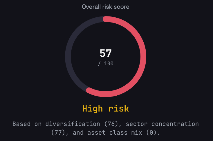
Four risk scores
Insights assigns four scores to your portfolio:
- Overall score (0-100) — a composite of the three scores below
- Diversification — measures how evenly capital is spread across holdings, based on the Herfindahl-Hirschman Index (HHI)
- Sector balance — measures exposure across industry sectors like technology, healthcare, and financials
- Asset class distribution — measures how your portfolio is split across stocks, ETFs, crypto, metals, and other asset classes
Each score maps to a risk rating:
| Score | Rating |
|---|---|
| 80-100 | Low risk |
| 60-79 | Moderate |
| 40-59 | High |
| 0-39 | Very high |
A higher score means better diversification and lower concentration risk.
Visual breakdowns
Two donut charts show your sector allocation and asset class split at a glance. For ETFs, the system resolves underlying holdings so sector weights reflect what your ETFs actually own, not just the ETF itself.
Excluding holdings from scoring
Some holdings can skew your diversification scores. Property, cash equivalents, and dust positions (very small holdings) can be excluded from the analysis so they don't distort results.
ETF overlap detection
When your portfolio contains two or more ETFs, a card appears on the insights page showing the number of shared holdings and the average overlap percentage. Click through to open the full ETF overlap page.
ETF holding overlap
A dedicated page shows exactly where your ETFs duplicate each other. This helps you spot unintentional concentration and decide whether multiple ETFs are adding real diversification or just doubling up.
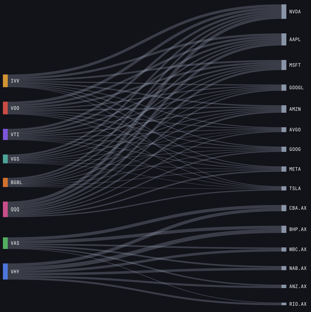
Sankey diagram
An interactive flow diagram visualises the connections between your ETFs and their shared holdings. ETFs appear on the left, shared underlying stocks on the right. The width of each connection represents the weight of that holding in the ETF. Hover over any connection to see exact percentages.
Shared holdings table
Every stock that appears in more than one of your ETFs is listed in a detailed table. For each shared holding, you can see the weight it carries in each fund. Sort by weight to find the stocks creating the most overlap.
Overlap summary
The summary shows the average overlap percentage across all your ETFs, along with a pairwise breakdown between each ETF pair. A high pairwise overlap (60%+) means those two ETFs largely duplicate each other's exposure.
Fund-of-funds look-through
Some ETFs hold other ETFs as underlying positions. The overlap tool resolves these sub-ETF holdings to calculate true overlap. This works with both US and Australian ETFs.
The free plan shows the top 20 underlying holdings per ETF. Pro shows all holdings for a complete picture. If you want to quickly compare ETFs without adding them to a portfolio, the free ETF compare tool lets you do that directly.
Getting started
- Portfolio insights — open any portfolio and navigate to the Insights tab
- ETF holding overlap — select ETF overlap from the portfolio menu
- Help guides — portfolio insights and ETF holding overlap cover everything in detail
Have questions or need help? Visit our support page or check our help guides for detailed walkthroughs.